
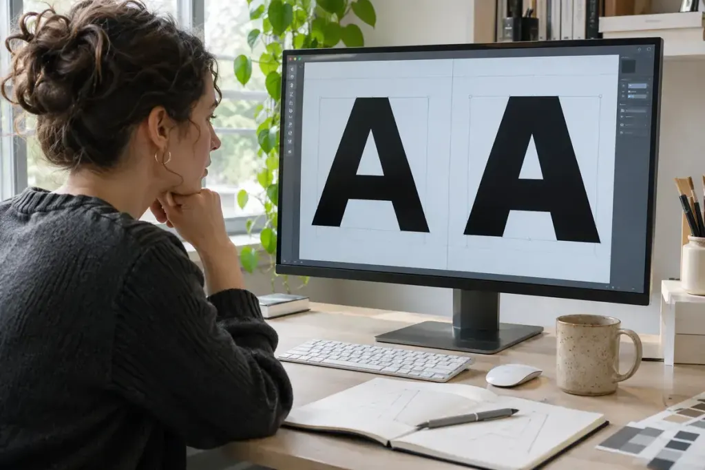
A heading can look bold even when the bold font file never arrived. Browsers may synthesise a heavier appearance from an available face. This fallback helps text remain readable, but it can explain why a carefully chosen type family looks unexpectedly crowded or blunt on the published page.
MDN’s font-synthesis reference describes controls for browser-generated styles such as bold and italic. Synthetic bold is not the same as using a weight deliberately drawn by the type designer. Adding thickness to an existing outline and loading another designed face can produce different counters, joins and spacing relationships.
Check the font before adjusting the layout
Imagine a heading styled with font-weight: 700, while the site only declares a regular face at 400. Increasing the heading’s letter spacing may make the symptom less obvious, but it does not establish that the intended bold face is being used.
- Inspect the heading’s computed font family and weight in browser developer tools.
- Check the rendered-font information where the browser provides it; the CSS declaration alone is not proof of the actual face.
- Inspect font requests for failures and verify that the relevant
@font-facedeclaration matches the file and intended weight. - For a variable font, check that the declared range and the file’s supported axes cover the requested weight.
Only then compare a diagnostic version with synthesis disabled. For example, font-synthesis-weight: none; can prevent synthetic emboldening in supporting browsers. It does not download the missing face, correct a broken URL or manufacture a proper 700 weight.
Keep a test line with awkward letters
Use a short heading containing rounded letters, tight joins and the punctuation used in the real design. Compare it at the actual display size, rather than judging an enlarged screenshot alone. Check a fresh browser session too, so a locally installed copy of the font does not hide a deployment problem.
Record the file and weight that produced the approved result. “Looks bold on my laptop” is a fragile specification; a verified font face gives the next person something concrete to reproduce.