
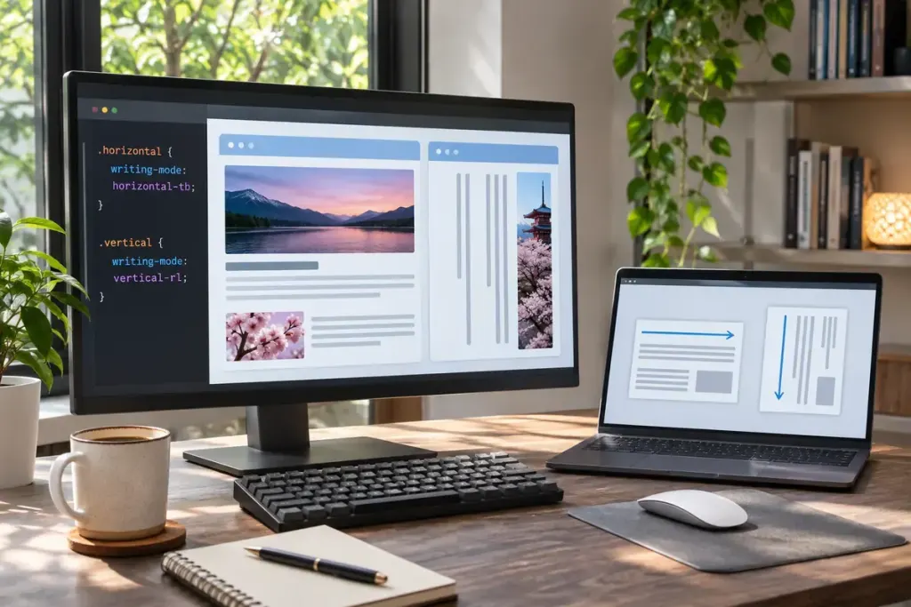
A vertical heading is not always a horizontal heading turned on its side. CSS can establish a vertical writing mode, changing how text lines and their containing layout flow.
The MDN writing-mode reference describes horizontal and vertical modes, including the direction in which successive lines are placed. This differs from a transform that rotates an already laid-out element.
Start with the direction you need
In a typical left-to-right context, writing-mode: vertical-rl places text vertically and adds subsequent columns towards the left. vertical-lr adds them towards the right. Character orientation is a related but separate concern, so test the actual language and punctuation rather than a row of placeholder letters.
For an experimental section label, apply the mode to that small component first. Give it a realistic amount of text and inspect its surrounding space. A one-word demonstration can hide problems that appear when a translated label is longer.
Think in inline and block directions
Properties expressed in logical directions become useful when the writing mode changes. The inline direction follows the text flow; the block direction follows the stacking of lines. Those directions are not permanently equivalent to horizontal and vertical.
When debugging, outline the element’s box and compare its dimensions before and after the change. Check where padding, borders, and neighbouring items end up, rather than judging only whether the letters appear vertical.
Also test selection, keyboard navigation, zoom, and a narrow viewport. Decorative typography should not turn a short navigation label into something visitors struggle to read or activate.
Keep the content as real text with appropriate language markup. A screenshot of vertical lettering loses the flexibility that made the CSS approach useful in the first place. Use the effect where the language or design benefits from it, and let the rest of the page remain easy to follow.