
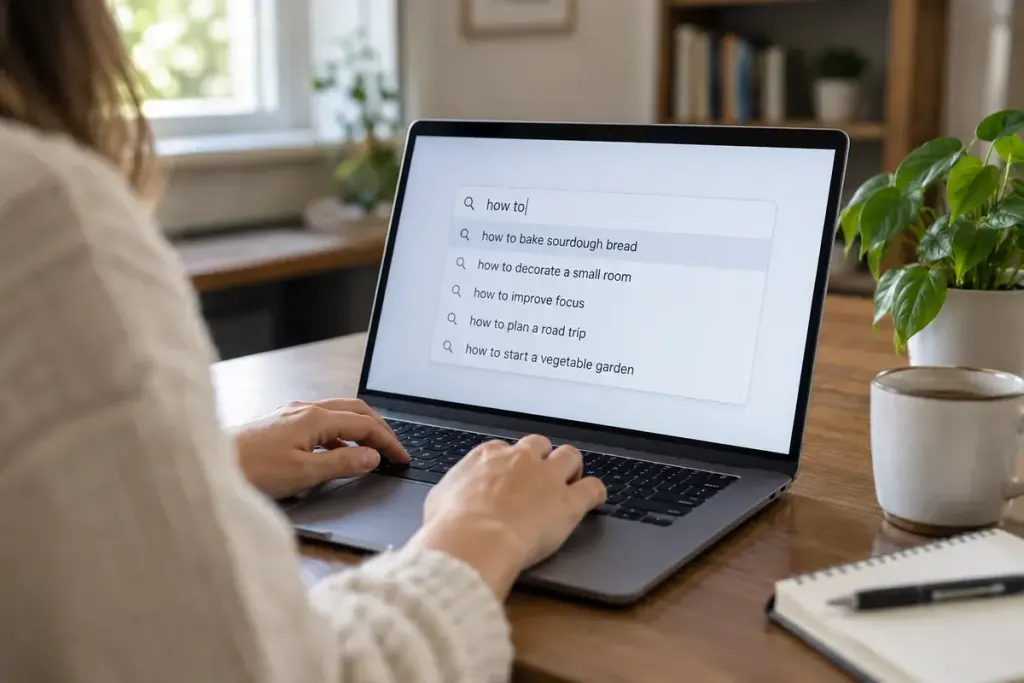
A search box can offer excellent suggestions and still be difficult to use without a mouse. The problem often appears after typing, when a list opens but the keyboard user cannot tell which suggestion is active or how to leave it.
An editable combobox is one established pattern for this interaction. The W3C ARIA Authoring Practices combobox guidance describes expected semantics and keyboard behaviour for several popup types. Choose the appropriate pattern instead of adding roles to an unrelated menu and hoping they fit.
Test the complete journey
Use a realistic query and keep the mouse aside. Enter the field with Tab, type a few characters and wait for suggestions. Check whether the input’s purpose, expanded state and relevant suggestion information are available to assistive technology.
Use the documented arrow-key behaviour to move through options, Enter to accept a selected suggestion and Escape to dismiss the popup. Then continue with Tab. The control should not trap you or require a mouse click to restore normal typing.
Preserve ordinary text-editing behaviour. Home, End, selection shortcuts and cursor movement already have familiar meanings in a text field. Capturing keys unnecessarily can make a search box feel broken even when its suggestions are technically reachable.
Try less tidy cases as well:
- No matching suggestions.
- A slow response followed by newer results.
- A long option name.
- A query containing spaces or accented characters.
- Dismissal without accepting any suggestion.
Ensure that an older response does not replace suggestions for a newer query. Keep the distinction between visual highlighting and the actual active option clear.
Automated checks can identify some missing attributes, but they do not prove that the interaction is understandable. Test with keyboard navigation and representative screen-reader/browser combinations, and involve users where possible.
If suggestions are not essential, a simpler labelled search field and submit button may be easier to implement well. When the richer control is justified, its keyboard path deserves the same attention as the quality of its matches.