
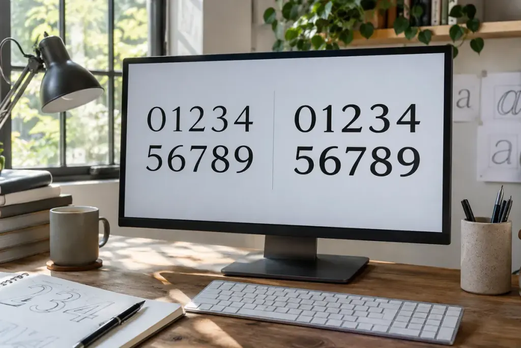
A dashboard counter changes from 111 to 888 and nearby text appears to shuffle. In a proportional font, different digits may occupy different widths. Tabular numerals request equal-width digit forms so that changing figures are less likely to disturb the layout.
The CSS property font-variant-numeric includes the tabular-nums value. It uses the font’s supported numeric features; it does not turn the whole typeface into a monospaced font.
.metric-value {
  font-variant-numeric: tabular-nums;
}
This is an illustrative style rule. Apply it to the relevant values rather than assuming every paragraph on the page benefits from the same numeric treatment.
Test the figures that expose movement
Create a small comparison using 111, 888, 101 and 808 in the actual font. Then test realistic values from the interface: negative numbers, decimals, currency symbols and the transition from three digits to four.
Equal digit widths do not make different-length strings the same size. A counter moving from 999 to 1000 still gains a digit. Depending on the design, a suitable minimum width or a stable container may be needed too.
Alignment is a separate decision
In a financial table, align comparable values deliberately and use consistent precision where appropriate. Tabular digits alone do not align decimal points across a mixture of one and several decimal places. They also do not correct inconsistent separators or number formatting.
Check the actual web font and fallback font. If the intended feature is unavailable, the browser cannot conjure the desired alternate glyphs. Test after the font loads as well as under a fallback condition, especially where a changing counter sits beside a button or label.
Finally, read the result at normal size and on a narrow screen. The purpose is a calmer, more legible display, not a typography feature added for its own sake. Keep the underlying number as meaningful text so presentation does not interfere with copying, accessibility or interpretation.