
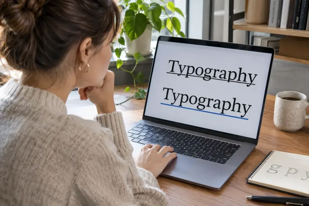
In an underlined word such as “playing”, the lower parts of the letters can meet the line. A small gap around that ink may improve the appearance and readability. CSS provides a property for this detail: text-decoration-skip-ink.
Mozilla’s property reference describes how underlines and overlines avoid glyph ink. It is separate from the text-decoration shorthand, which is useful to remember when a reset or component style seems to change the result.
A small starting rule
a {
  text-decoration: underline;
  text-decoration-skip-ink: auto;
}
This example leaves the browser to determine the interruptions around the letters. Using none requests a continuous line instead. It does not change the link destination, keyboard behaviour or the meaning of the text.
The example is intentionally small. Apply it in a test component before adding it to a large stylesheet, where inherited decoration and more specific rules may also affect the result.
Test a sentence, not just a logo word
Use text containing descenders, punctuation, several line breaks and the scripts your site actually supports. Inspect the real font at normal reading sizes and under zoom. A setting that looks elegant in a large heading can become fussy in a dense paragraph.
Mozilla’s text-decoration guide also discusses underline offset and thickness as separate controls. Change one property at a time so you can see which adjustment improves the text.
Keep the link recognisable in its normal, hovered and focused states. A tiny typographic refinement should not result in removing the only visible distinction between a link and surrounding prose. Check contrast and keyboard focus as part of the complete component.
For a review note, record the font, size, browser and sample sentence. “The underline looks cleaner” is subjective; showing that letters remain legible and links remain obvious at the intended size gives the team something concrete to assess.